
CASE · PRAKTIJK LIESJE

A site that feels like her treatment room.

Calm with warm neutrals, soft contrast and a single accent. All of it suits Liesje, a beautician and relaxation therapist with more than ten years of experience.

BELGIUM · BRAND IDENTITY · WEBSITE · LIVE
A price list organised.

50+ treatments, sorted into eight categories. Tap one and only those prices open, so there’s no endless scrolling.

Tap-to-open categories

Booking button always in reach

WhatsApp in one tap

Clear information is the key to trust.

Liesje’s time belongs to her clients. The website answers the everyday questions, so every conversation starts from a place of trust.

Everyday questions, answered:

treatments

prices

how to get in touch

One consistent look:

logo

signage

social feed
Liesje PRAKTIJK · KONTICH
Afspraak maken

MASSAGES

ONTHARING

GELAAT

HOTSTONE & COLDSTONE

VOETEN & HANDEN

OORKAARSTHERAPIE

MAKE-UP & HAIRSTYLING

KIDS & TEENS

THE CHALLENGE · THE APPROACH

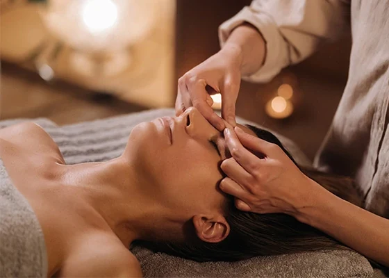
Facial treatment at Praktijk Liesje

01

BRAND
Brand direction first Three directions on a board; the chosen one takes its cue from the treatment room itself, warm neutrals, soft contrast, a single accent.
Logo and full variation set Primary, horizontal, icon and one-colour versions, in every format needed for signage, print and social.

02

SYSTEM & TEMPLATES
Colour and type system A palette and type scale with accessible contrast rules, so every future piece stays legible and on-brand.
Social and print templates Editable templates for posts, stories and the price list, so the feed stays consistent without a designer.

03

PRICE LIST & BOOKING
Every price on one page Eight categories, each treatment with its duration and price, so the questions that used to come by phone are answered before anyone asks.
Booking in one tap The booking button opens WhatsApp with a ready-made message, so clients book in seconds and Liesje answers between treatments.

Something similar in mind?